
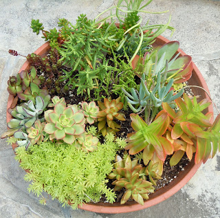
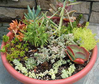
we all scream for...sedum
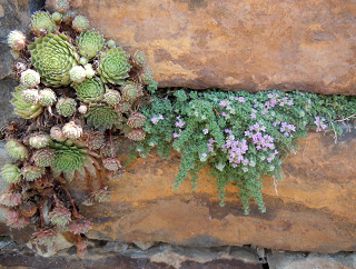
Dangly hens and chicks
I have long known that sedum is the greatest. It requires little care, spreads abundantly, and has very lovely blossoms. What I knew, but also didn't know, is that it comes in a beautiful variety of colors that look amazing together. I've been having lots of those moments lately. I know something in my brain, but my mind is blown by realizing it again. Another example is when I realized/remembered that the earth is turning and that the sun isn't setting, we are turning away from it. It's ok. You can roll your eyes at me.
Powell Gardens again surprised me with inspiration. Here are sedums for your perusal.
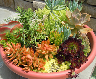
This one is my favorite. That dark one next to the tiny lemon yellow, next to the peach, surrounded by various shades of green is simply lovely.
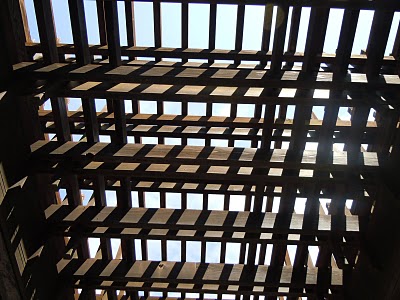
line and shadow inspiration
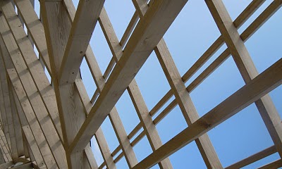
My parents were in town visiting this weekend and we went to Powell Gardens just outside KCMO. It's a beautiful place to spend a few hours, but I was surprised by how much garden architecture there was. I love the intersecting lines in the one above.
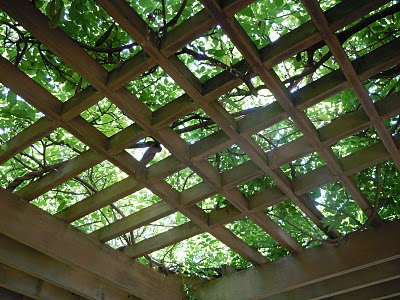
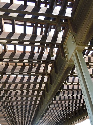
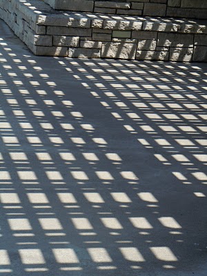
There may be some Powell Garden inspired quilts on the way.
Computer + Kim = Quilt?
I've been seriously considering making functional quilts lately. I guess technically all of my quilts could be functional, but they're not meant to be. I've been sleeping under a hand-made quilt for almost two years now and every time I make the bed (which isn't very often, granted) I'm reminded of how special it is.

me and my quilt (and the awesome pink chair my husband found in a dumpster)
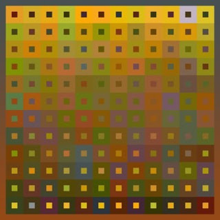
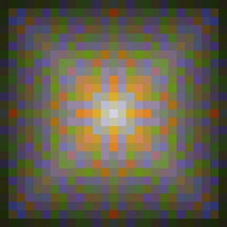
So I've been working up some designs and thinking and stewing over what these quilts should be. I think I'm getting close. As soon as summer school is over (3 more days!) I'm going to jump in and see how it goes. Until then, a preview of my designs made in Pointcarre.

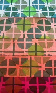
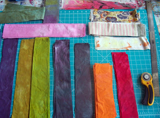
This is the palette and gradations I created. It was all very scientific. Mostly I looked at a ton of different pictures from all different magazines, like Martha, Australian Vogue, National Geographic, Dwell, etc. and cut out the photos that drew me in. Then I matched the 5 main colors in the photos to paint chips from the hardware store. From there I could analyze which colors were present most often and narrow it down to this select group of 24. All of my designs will be based off those 24 colors.


The circles on these two would be thioxed out.


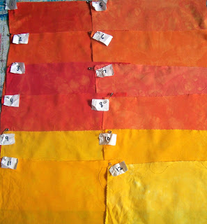
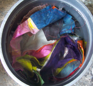
The most nerd-tastic part of the whole process is color matching my fabric to the paint chips. It involved many many (many) dye baths and re-calculations, but I finally got all of them.
So. Up first are some crib quilts as samples. Anyone know any babies in the market for a hand-made quilt?
I'm having a show!

Steve Brisendine, a local artist and art critic wrote about it for Review. You can read about it here. Thanks Steve!
No pictures of the show yet, but I'm planning to take some before it comes down.
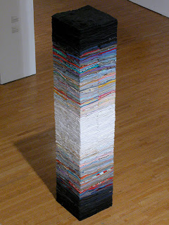
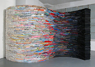
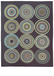
Color Inspiration
I've been thinking about color in my environment more than usual for two reasons. First, I'm trying to figure out what colors to paint the rooms in my house. Second, I'm attempting to change up my usual color schemes in my quilts. Below are a three artists I recently discovered who work with colors that I'm drawn to but don't normally use. Sometimes the things I make are not the things I like. From a logical point of view this doesn't make much sense. I would like to being to bridge the gap.
semi monochromatic gradations with pops of color
Flesh of My Flesh
The Ocean is the Underlying Basis for Every Wave
I would probably call these vintage colors
He Was Packing All Night
Rubik's Kitchen
Complimentary colors without being garish
(complimentary means opposite on the color wheel,
i.e. blue and orange, yellow and violet, red and green)
Forsythia
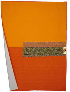
In and Out of orange
orange you glad I didn't say...I can't remember the rest.
A lot of unproductive things have been going on in my studio lately. I feel all fired up about working, but whenever I actually get in my studio my brain poops out on me.
Today was so bad that I didn't even bother to take photos. I had this idea that I would coat string in thickened dye, then stitch into fabric with it and let the dye bleed into the fabric. I set up a whole experiment with wet string in wet fabric, dry string in wet fabric, wet string in dry fabric and dry string in dry fabric. Then I started on the wet on wet sample. For anyone that has sewn before, you know where this is going. It is painfully difficult to sew into wet fabric. Not to mention that my string was coated with wet dye so I had to wear my rubber gloves. I gave up after about 2 minutes.
Here is the rest of the not so great stuff I've been doing lately. I have to keep faith that it will all make sense soon if I can just keep showing up.
orange color studies
hand-printed yardage, overdyed different colors
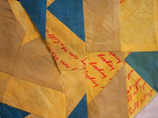
An attempt at using up old fabric to save money. These are some of the left over reject fabrics from past quilts that I cut into strips and then sewed into mini log cabins.
Then overdyed them (this is them waiting to be dyed)
They are still heedious but will get better. They've been overdyed again since this picture was taken and are now a dark gray color. Much better.
On a high note, there was a decent turnout for my open studio last friday night. I think I'll go plant some onions.
little yellow birds
Joetta Maue wrote about my narrative quilts over at her blog little yellow birds.
Check it out and spend some time over there. She covers a lot of really interesting fiber work being made right now. Thanks Joetta!

Check it out and spend some time over there. She covers a lot of really interesting fiber work being made right now. Thanks Joetta!
Symmetry
Do you ever look in the mirror for too long and freak out about how asymmetrical you are? Please don't tell me I'm alone here.
Well, today I was reading a book about tesselations and symmetry by Jinny Beyer and there was an example of famous faces that were split in half and repositioned to be symmetrical. It is so interesting. In two of the three examples one of the symmetrical faces is far more attractive than the other.
So. Here are my three versions. I like to think of the two symmetrical ones as my dopplegangers. One of them is not very attractive. Be warned...
normal Kim
symmetrical Kim #1
This one is terrible. It could be my ugly twin's mugshot.
My father-in-law warned me that I need to be careful with social networking and sharing information. I think he was joking, but this might be a good example of too much sharing.
Quilt Appreciation Day!
The third Saturday in March is officially Quilt Appreciation Day. That seems especially fitting on a day like today that is so gray and snowy (at least it is in good old Kansas City). In honor of today, I thought I would share with you my top 5 favorite quilters ever.
1. Mary Anne Jordan. Her quilts are amazing. They are mostly whole cloth quilts that she paints with dye. Not only does she make beautiful work, Mary Anne is a wonderful person and is one of the key people that led me to quilting. She is head of the Textiles program at the University of Kansas and leads textiles trips to Uzbekistan. I got to touch one of her quilts a few years ago when she hired me to sew the binding on.
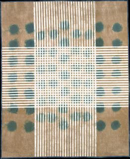
3. Anna Von Mertens. From her artist statement: "Displaying my quilts as bed sculptures surfaces inherent meanings: the body, the home, a place of the familiar, a centering point. The stitch patterns diagram various mapping systems--scientific phenomenon, energy dispersion patterns, bird migration routes, computer circuitry, etc.--using the intimate lens of the bed and handstitching to internalize these patterns. Objective information is translated to the subjective, building a world of reference points that create a whole." 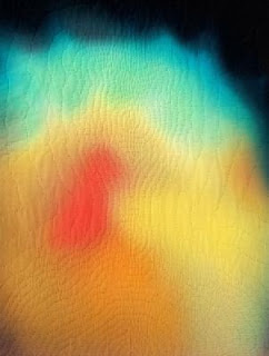
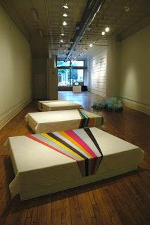 Installation photo of Pulse 2006 (a group show) at 1708 Gallery in Richmond, VA
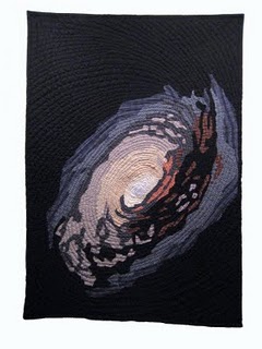
4. Jimmy McBride. His quilts are relatively new to me but I am so excited about what he's doing (so are Dwell Magazine and Apartment Therapy). Posing as a space traveling trucker, Jimmy makes quilts based on actual photos of space. All of his fabric comes from thrift stores. He also has a blog where you can see photos of his process. Pretty amazing.
1. Mary Anne Jordan. Her quilts are amazing. They are mostly whole cloth quilts that she paints with dye. Not only does she make beautiful work, Mary Anne is a wonderful person and is one of the key people that led me to quilting. She is head of the Textiles program at the University of Kansas and leads textiles trips to Uzbekistan. I got to touch one of her quilts a few years ago when she hired me to sew the binding on.
Tablecloth with Indigo Stains
95"H x 78"W
COPYRIGHT: ©2004 Mary Anne Jordan
exhibition shot
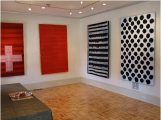
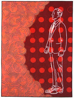
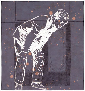
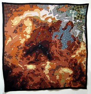
2. Bean Gilsdorf. I first learned about Bean's quilts when I was in graduate school at KU. I was immediately drawn to the scale of them and her use of imagery. Since then, I have had the chance to see her work in person twice, most recently at the Surface Design Conference last summer in Kansas City. She had a show at Sherry Leedy Contemporary Art. Her work continues to inspire me.
Into the Ether (2007)
50" w x 68" h
For Your Amusement (2007)
105" w x 113" h
Frida Kahlo's aura, with Thorn Necklace and Hummingbird
2009, hand-dyed, hand-stitched cotton, 24 1/4" x 18 1/2"
R136 in 30 Doradus
77" x 78" hand made and machine quilted
M64
45" x 60" child's quilt
5. Denyse Schmidt. I secretly want to be Denyse Schmidt when I grow up. Unfortunately, I think I'm already grown up and clearly not her. Denyse designs and makes functional quilts (rather than quilts for the wall). She has an excellent book, designs her own line of fabric, and has three different lines of quilts: Couture quilts (hand quilted by Amish women), Works quilts (machine quilted), and Denyse Schmidt for Sarita Handa (she designs the quilts and they are made in India - this is her most affordable line). I actually like some of the Sarita Handa and Works quilts the best.
Works Special Edition (Tangerine/Poppy)
Denyse Schmidt for Sarita Handa
What a Dish
Yay for Quilts!
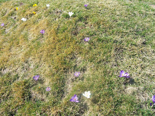
I'm stuck, yo.
The crocuses (croci?) in my yard think it's spring.
Kim: "I have so much time to get stuff done."
Bad influence Kim: "You better not waste your time. You're wasting your time."
Kim: "But I have a whole week. Think about everything I could do in one week."
Bad influence Kim: "The week will go really fast. Plus, you're on spring break. Enjoy it."
Kim: "Oh, but I have so much time to work in my studio."
Bad influence Kim: "Wouldn't you rather just watch Lost on the interweb?"
Kim: "I guess one episode wouldn't hurt..."
Yikes!
So I made myself go to studio today and printed some fabric. I'm still stuck, but at least I got in some good practice with my new registration t-bar.
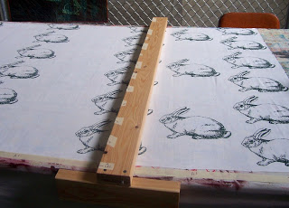
Rabbit print in progress. That's my t-bar there. It took me about 2 hours to make it yesterday because I had some power saw anxiety and couldn't find the drill bits. Plus, I was going to have the wood cut at Lowe's but someone had sawed through their power cord. Blerg.
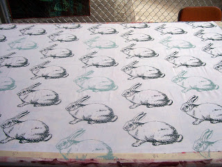
Finished rabbit print. These little guys are in half-drop formation. After printing, I thought "those rabbits should be closer together, like a herd." So I re-measured and made this:
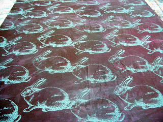
Poor little things are butt sniffers. After the first one was printed sniffing his friend's butt I considered stopping and starting over. I'm not really sure why I kept going. Next time I'll measure better.
I also printed this fabric today:
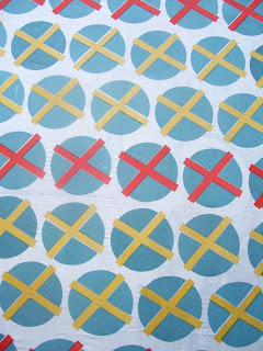
This was a practice for using hand cut stencils and multi-colored printing. This fabric is also not perfect but in this case the measuring was fine, it was faulty labeling. Kim! Pay attention!
Spring Break Madness
Yay for Spring Break and not getting enough done. This post is not even remotely quilt related, but the task took enough brain power to be worth about 1/2 a quilt.
Ages ago I saw a post on Apartment Therapy that was closet doors painted in a trellis pattern. I've been thinking about that pattern ever since we bought our house and trying to figure out where to put it. The entry way won out over the bathroom or dining room. With my mom as assistant, we went for it:

This is our entry before. It wasn't a bad entry, just not too exciting.

9" x 12" template + pencil + razor blade + level + almost two packages of frog tape =
a beautifully taped entry.
It felt like we should have been done at this point...but no.

Painting is fun! This was the quickest step, only taking about 30 minutes per coat of paint.

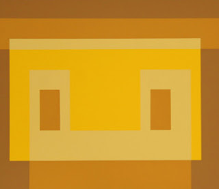
Josef Albers is my sunshine
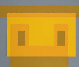
These are some of my favorite Albers paintings. They are a revelation. Normally when I think of Albers' work, I picture the square inside a square.

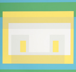
I'm thinking about doing a series of quilts based on these paintings. They would make beautiful crib quilts. Sometimes it's nice to work on something very formal and traditional as a counterbalance to the personal/creepy/rabbit quilts.

Pretending to be a designer

They Seek, 2010
Every once in a while I have fantasies about becoming a famous designer - like Denyse Schmidt, Jonathan Adler, or Lotta Anderson. These episodes usually occur after spending way too much time on Apartment Therapy. In the course of trying to make our home more "us" Simon and I have frequently turned to AT for inspiration. Last weekend, on a whim, I painted a back splash in our kitchen (thanks for the support, Mom). Just this week I decided to make over our staircase. This will involve ripping up the carpet, painting the plywood stairs underneath and applying FLOR tiles to the treads. Simon's big job is turning our awkward, unfinished attic/closet mess into something attractive and usable (with much guidance from my Dad).
I digress. Back to the fantasy at hand. This week I introduced my students at KCAI to our new textile design software, Pointcarre. This re-awakened my secret wish to be a fabulous designer.
Here are some examples of what I'm playing around with:
Here are some examples of what I'm playing around with:
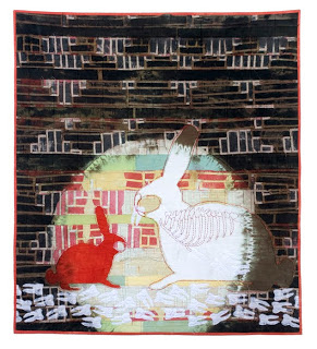
I like to start with my own work as inspiration. The quilt at the top, "They Seek", was finished over winter break. I zoomed in on different parts of it to create the patterns below.

rabbit spines

heads with eyes - I like the white teeth

mirrored mouths - looks a bit like flying saucers
The first one is my favorite. I want to try some different colorways and scales. I'm thinking of having it printed at Spoonflower. We do have a large format printer at school but honestly, it seems like too much work to format, check color, and print. I would rather pay someone else to do it.
*P.S. - I found my studio keys. Yay! And did I mention it's snowing again?
ITMA day 2 - Pearson
Blogging is so much harder now that I'm teaching again. I just got around to getting the rest of the pictures off my camera from my North Carolina trip.
On the second day we went to Pearson Furniture Company in High Point, NC. It is an incredible place. We were able to take a tour of the whole plant and see how a piece of furniture is made from start to finish.
Some highlights are below:
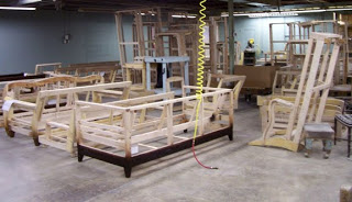
Assembled frames waiting to move to the next station.
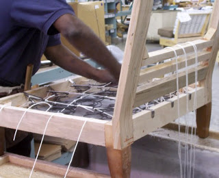
They do eight way hand-tied springs. Those are some nimble fingers.
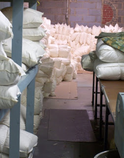
Cushions waiting.
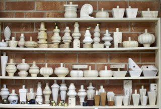
Legs!
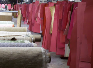
These are all the patterns for their upholstery.
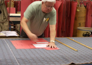
A pattern being cut out of fabric. There was also a CAD machine that cuts out their solid color fabric, but real people hand cut all of the patterned fabric. Incredible. I can barely make a slipcover.
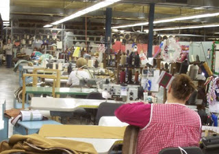
A row of industrial sewing machines. These ladies were just zipping through the fabric. It was amazing how fast and accurate they were.
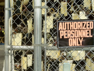
All of the expensive fabric was placed behind barbed wire fences that get locked up at night. It was weird. Our tour guide said that they once had fabric with actual gold woven into it. They have also had fabric that costs $300 per yard! That's about $295 more than I'm willing to spend.
I wish I had taken some pictures of finished furniture. We didn't see an actual showroom, so all the furniture was in progress.
On the second day we went to Pearson Furniture Company in High Point, NC. It is an incredible place. We were able to take a tour of the whole plant and see how a piece of furniture is made from start to finish.
Some highlights are below:
Assembled frames waiting to move to the next station.
They do eight way hand-tied springs. Those are some nimble fingers.
Cushions waiting.
Legs!
These are all the patterns for their upholstery.
A pattern being cut out of fabric. There was also a CAD machine that cuts out their solid color fabric, but real people hand cut all of the patterned fabric. Incredible. I can barely make a slipcover.
A row of industrial sewing machines. These ladies were just zipping through the fabric. It was amazing how fast and accurate they were.
All of the expensive fabric was placed behind barbed wire fences that get locked up at night. It was weird. Our tour guide said that they once had fabric with actual gold woven into it. They have also had fabric that costs $300 per yard! That's about $295 more than I'm willing to spend.
I wish I had taken some pictures of finished furniture. We didn't see an actual showroom, so all the furniture was in progress.
ITMA day 1
I am writing this from High Point, North Carolina. KCAI was invited to bring five students to tour textile mills as part of the International Textile Market Association's Educational Fund. The tour is an excellent opportunity for our students because we don't really teach about the textile industry at KCAI. Some of the other schools that are here, such as SCAD, Philadelphia University, and North Carolina State seem to really focus on industry and preparing their students for practical applications of textiles. We are more interested in the fine art side of Fiber. They are two different animals.
I'm a little bit behind putting pictures up, so I'll start with yesterday. There has been so much to see and absorb! Yesterday we went to Valdese Weavers which is a mill that makes jacquard woven cloth for the home. They have a few of their own lines of cloth and also do custom work for "jobbers". I'm still learning all the lingo.


One of the things I found most interesting at Valdese Weavers is that they dye their own yarn. The white yarn above has been wound from large cones to smaller cones with hollow cores. It is ready to be put in the dye vats. The racks of yarn above have been dyed and are drying. It's amazing that they can get such perfect, even color every time. I struggle to do that on a skein of sock yarn (like 1/100th of one of those cones).


Above is one row of their yarn storage. There were probably about 5 rows and they are stacked floor to ceiling with yarn. Amazing. The other picture above is the yarn being wound to get ready to weave.


Above are two pictures of Jacquard looms in action. The first is a view from the back. The red yarn below is the warp. The second picture is of a "blanket" being woven. A "blanket" is not a fuzzy thing to keep you warm. It is basically a sampler - one pattern woven with multiple warp and fill colors to get many variations. I love these. If I worked in Industry I would only make blankets and I would cover things in them.

This last picture is a design wall. They briefly talked to us about designing and what goes into it. I was amazed by how complex every step is and how intertwined everything is. This was my second year on the tour and even though I'm totally amazed by the things I saw, I don't think the textile industry is for me. Let's hope this academia thing works out!
We also went to a gorgeous design house in Charlotte owned and run by Wesley Mancini. I am uber tired so will post pictures of that tomorrow.
I'm a little bit behind putting pictures up, so I'll start with yesterday. There has been so much to see and absorb! Yesterday we went to Valdese Weavers which is a mill that makes jacquard woven cloth for the home. They have a few of their own lines of cloth and also do custom work for "jobbers". I'm still learning all the lingo.
One of the things I found most interesting at Valdese Weavers is that they dye their own yarn. The white yarn above has been wound from large cones to smaller cones with hollow cores. It is ready to be put in the dye vats. The racks of yarn above have been dyed and are drying. It's amazing that they can get such perfect, even color every time. I struggle to do that on a skein of sock yarn (like 1/100th of one of those cones).
Above is one row of their yarn storage. There were probably about 5 rows and they are stacked floor to ceiling with yarn. Amazing. The other picture above is the yarn being wound to get ready to weave.
Above are two pictures of Jacquard looms in action. The first is a view from the back. The red yarn below is the warp. The second picture is of a "blanket" being woven. A "blanket" is not a fuzzy thing to keep you warm. It is basically a sampler - one pattern woven with multiple warp and fill colors to get many variations. I love these. If I worked in Industry I would only make blankets and I would cover things in them.
This last picture is a design wall. They briefly talked to us about designing and what goes into it. I was amazed by how complex every step is and how intertwined everything is. This was my second year on the tour and even though I'm totally amazed by the things I saw, I don't think the textile industry is for me. Let's hope this academia thing works out!
We also went to a gorgeous design house in Charlotte owned and run by Wesley Mancini. I am uber tired so will post pictures of that tomorrow.
Day of Business
Today is a big day full of biz-ness. I really dislike business days and have to get through them by tricking myself. Today I'm doing task and reward. This is how it works: if I do 1 hour of task/business, I get to watch one episode of Heroes on Hulu. It works pretty well.
The business that I'm working on is updating my website, resume, spreadsheet, and all my digital files! Thanks to my friend Steve Curtis, who has a studio upstairs from me, I have new pictures to post on my website. He did a fantastic job. The colors came out perfect and they are such high quality images. I'm really pleased! I've also changed up the layout a little. So run over there and check it out!
Here is a teaser:
They Gnaw, 2009
I'm also getting ready for a trip to North Carolina next week. I'm taking five students from KCAI on a tour of textile mills. The tour is hosted by the International Textile Market Association. Each year they invite 30 students from Fiber/Textile programs to go to North Carolina and see first hand how the textile industry works. Primarily the tour in NC focuses on textiles for furniture. It's all very interesting and really made me realize I'm not cut out for "industry".
I'll be posting pictures of the trip next week. Stay tuned.
I'll be posting pictures of the trip next week. Stay tuned.
Wonder Under is for friends
I just finished doing yoga* and realized I hadn't written a blog post yet today and there's much to report. Things are really coming along but I feel like this quilt is going a little too smoothly. It worries me a bit. It seems like whenever I have an easy quilt the next one is painfully slow and has to go through many transformations. Better gear up now.
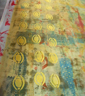
I started the day by printing yellow eyes onto some yellow silk organza that I had great plans for months ago (they fell through). I used the same yellow aqua brite pigment that I used to print some of the rabbit heads and half of the spine. I always keep my leftover pigment colors just in case. They don't go bad if you store them in a closed container, like an empty yogurt bin. Silk organza is lovely and crisp and sheer. You can just barely see it in these pictures with my busy/dirty drop cloth showing through. One of the interesting things about organza is that when you print on it, the image soaks through so you're basically getting two for the price of one. You can see that on the second picture where I've scooted the organza up after printing and the eyes are on the drop cloth.
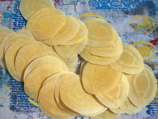
Then, I ironed wonder under to the back of the organza and cut out all the little eyes with my x-acto. I think I ended up with about 40 of them. What's better than a pile of eyes?
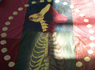
Here they are laid out on the quilt, pre-peeling and pre-ironing. I keep coming back to this halo idea in these quilts. I'm not even a little bit religious, but I keep getting the feeling that these rabbits need to be revered and I want to put them in halos like they're gods or saints.
So here is the quilt as I left it this afternoon. I painted on some reddish brown pigment to darken the background around the halo. The pigment needs to cure for about 24 hours and tomorrow I will need to heat set it. I'm planning quite a lot of hand embroidery on this one. So maybe tomorrow I can also start getting this bad boy ready for quilting. We'll see.
*by "yoga" I mean "yoga booty ballet" that I got from the library. It's bastardized yoga and I was embarrassed to check it out but I do like all the talk about being "supple" and my "muscular booty". I'm also pretty sure it's not OK for a grown woman to say "booty" unless she's talking about the delicious snack called "pirates booty".
I started the day by printing yellow eyes onto some yellow silk organza that I had great plans for months ago (they fell through). I used the same yellow aqua brite pigment that I used to print some of the rabbit heads and half of the spine. I always keep my leftover pigment colors just in case. They don't go bad if you store them in a closed container, like an empty yogurt bin. Silk organza is lovely and crisp and sheer. You can just barely see it in these pictures with my busy/dirty drop cloth showing through. One of the interesting things about organza is that when you print on it, the image soaks through so you're basically getting two for the price of one. You can see that on the second picture where I've scooted the organza up after printing and the eyes are on the drop cloth.
Then, I ironed wonder under to the back of the organza and cut out all the little eyes with my x-acto. I think I ended up with about 40 of them. What's better than a pile of eyes?
Here they are laid out on the quilt, pre-peeling and pre-ironing. I keep coming back to this halo idea in these quilts. I'm not even a little bit religious, but I keep getting the feeling that these rabbits need to be revered and I want to put them in halos like they're gods or saints.
So here is the quilt as I left it this afternoon. I painted on some reddish brown pigment to darken the background around the halo. The pigment needs to cure for about 24 hours and tomorrow I will need to heat set it. I'm planning quite a lot of hand embroidery on this one. So maybe tomorrow I can also start getting this bad boy ready for quilting. We'll see.
*by "yoga" I mean "yoga booty ballet" that I got from the library. It's bastardized yoga and I was embarrassed to check it out but I do like all the talk about being "supple" and my "muscular booty". I'm also pretty sure it's not OK for a grown woman to say "booty" unless she's talking about the delicious snack called "pirates booty".
Inching along
Not to complain or make excuses or anything but a lot has happened in the last 6 days. Mostly to appease my own guilt for not being in the studio (and not blogging about being in the studio) I'm going to list the events here:
1. There was another snowstorm.
2. Simon and I got in a car accident as result of said snowstorm (we were on our way to buy a new shovel and got rear-ended (everyone is fine)).
3. Our ceiling (our new ceiling in our new house) decided to leak because of all the snow buildup.
4. It has been colder than a you know what.
5. I'm still on winter break. Ok, so that's not a very good excuse. I'm starting to have that anxiety where you feel like you're running out of time and still have so much to do, but there's not enough time so you might as well not bother, so you don't do anything which makes you feel even more like you're running out of time. It's a vicious cycle and seems counter-intuitive to have winter break anxiety, but there you have it. It's even worse in the summer.
So finally today I was back in my studio. What did I work on? A big mathy measuring party called Depth of Shade Dyeing. It's my favorite. I dyed the cyclone-tastic spine fabric from last week and some leftover patchwork fabric from my last quilt.
Depth of shade is a way to dye fabric using specific ratios of weight of fabric to weight of dye. I only started using this method about a year ago and it is slowly but surely changing my life. It sounds complicated and sort of is at first, but once you get it everything goes so much smoother. The best part is that much less dye is wasted than using regular kitchen measurements for dyeing.
I primarily use procion MX dyes, which are a fiber reactive dye, and cellulose fibers (cotton).
Step 1. Weigh your dry fabric. You can use grams or ounces. It doesn't really matter what you use as long as you're consistent. My pieces of fabric are usually smallish (a yard or less) so I use grams for more accuracy.

Step 2. Write down how much the fabric weighs. All calculations are based on this weight.
This is how I write it:
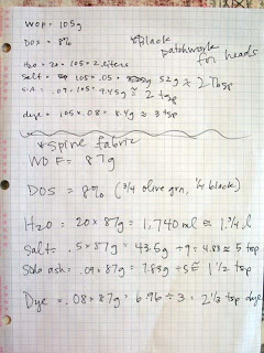
WOF (weight of fabric): 87g
DOS (depth of shade): 8% (you choose this. normally 8% is pretty dark, 1% is pretty light, 3% or 5% are good medium values)
H20: 20 x WOF = 20 x 87g = 1740ml (approx. 1.75 liters)
Salt: .5 x WOF = .5 x 87 = 43.5 g
Soda Ash: .09 x WOF = .09 x 87 = 7.83 g
Dye: .08 (8%) x WOF = .08 x 87 = 6.96
That's it. Those are your measurements. From there I usually convert to cups or teaspoons for easier measuring. You can see my lovely notes:
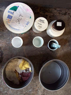
Step 3: Soak your fabric in water. Starting with wet fabric allows the fabric to dye more evenly than if it were dry. Sometimes it's ok to start with dry fabric, but only if you want it to look blotchy. Below you can see my two buckets with water. The one on the left is the fabric soaking, the one on the right is plain water that will become the dyebath.
Step 4: The order of the next few steps is up for debate*. My way of doing things is not necessarily the "right" way to do things but it gets the job done and saves a bit of time.
So Step 4a: Add salt to dyebath and stir well.
4b. Dissolve powdered dye in a small amount of water from the dyebath (wear a dustmask and gloves!!! wipe up any spills immediately!!!) and stir until there are no dry clumps of dye floating on the surface of the water. Stir the dissolved dye into the dyebath.
4c. Sprinkle the soda ash on the surface of the dyebath and then stir well. *This is where the debate can occur. All the instructions I've ever read claim that you must add the fabric to the dyebath before adding soda ash. You then stir frequently for 15 minutes, take the fabric out of the dyebath and put into a "holding bucket" and then add the soda ash (which has been dissolved in water first) to the dyebath. Only then can you return the fabric to the dyebath. I understand the merits of this method, but really it all seems like a waste of time and buckets.
4d. Add wet fabric to dyebath and stir well.
Step 5. The fabric needs to stay in the dyebath for about 45 minutes. The more you stir, the more even the dye will be. So I try to stir my fabric every 5 to 10 minutes but usually forget until its been the full 45 minutes. If I'm in a big rush and don't want a dark color, I might take it out after 30 minutes. I've also left fabric in a dyebath over night. No big deal.
Step 6. Wash the fabric out with warm water and synthrapol until the water runs clear. This process takes sooooo long and takes a ton of water. If anyone out there in the interweb knows of a dye that gets good even results on cotton and uses less water please let me know. This is also a time to wear gloves because synthrapol is very concentrated and can be rough on your skin.
Before and after
Before and After again
1. There was another snowstorm.
2. Simon and I got in a car accident as result of said snowstorm (we were on our way to buy a new shovel and got rear-ended (everyone is fine)).
3. Our ceiling (our new ceiling in our new house) decided to leak because of all the snow buildup.
4. It has been colder than a you know what.
5. I'm still on winter break. Ok, so that's not a very good excuse. I'm starting to have that anxiety where you feel like you're running out of time and still have so much to do, but there's not enough time so you might as well not bother, so you don't do anything which makes you feel even more like you're running out of time. It's a vicious cycle and seems counter-intuitive to have winter break anxiety, but there you have it. It's even worse in the summer.
So finally today I was back in my studio. What did I work on? A big mathy measuring party called Depth of Shade Dyeing. It's my favorite. I dyed the cyclone-tastic spine fabric from last week and some leftover patchwork fabric from my last quilt.
Depth of shade is a way to dye fabric using specific ratios of weight of fabric to weight of dye. I only started using this method about a year ago and it is slowly but surely changing my life. It sounds complicated and sort of is at first, but once you get it everything goes so much smoother. The best part is that much less dye is wasted than using regular kitchen measurements for dyeing.
I primarily use procion MX dyes, which are a fiber reactive dye, and cellulose fibers (cotton).
Step 1. Weigh your dry fabric. You can use grams or ounces. It doesn't really matter what you use as long as you're consistent. My pieces of fabric are usually smallish (a yard or less) so I use grams for more accuracy.
Step 2. Write down how much the fabric weighs. All calculations are based on this weight.
This is how I write it:
WOF (weight of fabric): 87g
DOS (depth of shade): 8% (you choose this. normally 8% is pretty dark, 1% is pretty light, 3% or 5% are good medium values)
H20: 20 x WOF = 20 x 87g = 1740ml (approx. 1.75 liters)
Salt: .5 x WOF = .5 x 87 = 43.5 g
Soda Ash: .09 x WOF = .09 x 87 = 7.83 g
Dye: .08 (8%) x WOF = .08 x 87 = 6.96
That's it. Those are your measurements. From there I usually convert to cups or teaspoons for easier measuring. You can see my lovely notes:
Step 3: Soak your fabric in water. Starting with wet fabric allows the fabric to dye more evenly than if it were dry. Sometimes it's ok to start with dry fabric, but only if you want it to look blotchy. Below you can see my two buckets with water. The one on the left is the fabric soaking, the one on the right is plain water that will become the dyebath.
Step 4: The order of the next few steps is up for debate*. My way of doing things is not necessarily the "right" way to do things but it gets the job done and saves a bit of time.
So Step 4a: Add salt to dyebath and stir well.
4b. Dissolve powdered dye in a small amount of water from the dyebath (wear a dustmask and gloves!!! wipe up any spills immediately!!!) and stir until there are no dry clumps of dye floating on the surface of the water. Stir the dissolved dye into the dyebath.
4c. Sprinkle the soda ash on the surface of the dyebath and then stir well. *This is where the debate can occur. All the instructions I've ever read claim that you must add the fabric to the dyebath before adding soda ash. You then stir frequently for 15 minutes, take the fabric out of the dyebath and put into a "holding bucket" and then add the soda ash (which has been dissolved in water first) to the dyebath. Only then can you return the fabric to the dyebath. I understand the merits of this method, but really it all seems like a waste of time and buckets.
4d. Add wet fabric to dyebath and stir well.
Step 5. The fabric needs to stay in the dyebath for about 45 minutes. The more you stir, the more even the dye will be. So I try to stir my fabric every 5 to 10 minutes but usually forget until its been the full 45 minutes. If I'm in a big rush and don't want a dark color, I might take it out after 30 minutes. I've also left fabric in a dyebath over night. No big deal.
Step 6. Wash the fabric out with warm water and synthrapol until the water runs clear. This process takes sooooo long and takes a ton of water. If anyone out there in the interweb knows of a dye that gets good even results on cotton and uses less water please let me know. This is also a time to wear gloves because synthrapol is very concentrated and can be rough on your skin.
Before and after
Before and After again
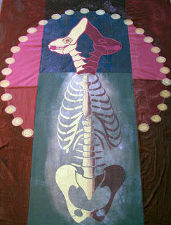
This is jumping ahead a few steps. The spine fabric turned out a little too dark - the red half was hard to see. So I sprayed thiox around the spine to lighten the green dye. Next, the two pieces of recently dyed fabric were sewn together and the heads from last week were applied to the top.
I think it's moving along...we'll see where it ends up.
I think it's moving along...we'll see where it ends up.
I will cut you
It's snowing. Again. So I was a bum and came home from my studio earlier than anticipated. Yes, I can walk home so snowy roads aren't really an issue. Yes, my studio has heat. No, I don't really have any excuses. I did bring work home to appease my guilty conscience.
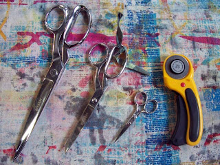
This is my scissors family. The big ones on the left have 6" blades. Those are some pretty serious scissors. I've cut myself numerous times with the rotary cutter. As a side note, I find it fun to say things like "hand me a scissor" or "I'm always losing my scissor" instead of the more common "scissors". Scissor is one of those words that sounds messed up if you say it too many times. Try it. (okay, I'm done entertaining myself now). These were my friends today as I wrapped up some loose ends with my quilt in progress:
For example:
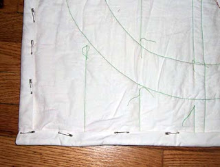
These are close ups of quilt corners. The one on top has the "full bleed" binding. Basically the binding is sewn on normally, then folded all the way to the back of the quilt and sewn down so it doesn't show on the front. On the bottom is a more traditional binding. Think of it as a border.
After the binding is sewn to the front of the quilt, I use safety pins to secure it to the back so I can hand sew it down without shifting anything. That way it looks nice and tidy and is perfectly secure.
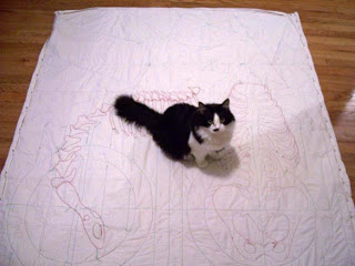
If you can find a cat to help you, everything will go much smoother and more quickly. Especially if said cat has claws.
For the back of this quilt I used white muslin. In the past I've always dyed fabric to use on the back, but lately I've been really interested in how the machine sewn "drawing" looks by itself. I'm thinking about making a whole cloth quilt that is all drawn by sewing machine.
I forgot to take in progress photos, mostly because I was on auto pilot for most of this, but today I finished the machine quilting on the top half of the quilt. Then pulled all loose threads to the back, tied them off, and trimmed them. I also squared and trimmed up the edges with first the big daddy scissor then the rotary cutter.
Then I stood and stared at the quilt for a while trying to figure out what to do about the binding. I decided on a binding that is hidden in the back, leaving an edge that you could call "full bleed" if you wanted to.
Then I stood and stared at the quilt for a while trying to figure out what to do about the binding. I decided on a binding that is hidden in the back, leaving an edge that you could call "full bleed" if you wanted to.
For example:
These are close ups of quilt corners. The one on top has the "full bleed" binding. Basically the binding is sewn on normally, then folded all the way to the back of the quilt and sewn down so it doesn't show on the front. On the bottom is a more traditional binding. Think of it as a border.
After the binding is sewn to the front of the quilt, I use safety pins to secure it to the back so I can hand sew it down without shifting anything. That way it looks nice and tidy and is perfectly secure.
If you can find a cat to help you, everything will go much smoother and more quickly. Especially if said cat has claws.
For the back of this quilt I used white muslin. In the past I've always dyed fabric to use on the back, but lately I've been really interested in how the machine sewn "drawing" looks by itself. I'm thinking about making a whole cloth quilt that is all drawn by sewing machine.
Starting a new quilt is scary/exciting
My work starts out really ugly. I've known this all along, but people never seem to believe me. A lot of my decisions are based on "what can I do to make this less ugly?" Now there is proof. Ugly, ugly proof. Even though I cringe inside when I think about putting the following pictures up, it is a really good example of how I work.
So. Here we go.
1. I started with a piece of red fabric, about 4' x 6' that had a large spine painted on it in light green. I made this fabric sometime in October or November and then it sat folded up on my shelves because it is hideous.

The fabric was pieced together from a few large scraps I had lying around. The spine is on the other side of the fabric. It was too much, so I decided to ignore it and work with the back side. Sometimes you just have to ignore something that isn't working and move on.
2. I cut a stencil to use on my last quilt that I'm still excited about. Here it is:

It's already taped onto my silkscreen. I'm not very good at planning, so the only way it would fit on the screen is to angle it and then fill in the open spaces with paper (so no ink leaks through the screen). It looks janky but it works.

Getting ready to print. I'm using Aqua Brite textile pigments for this. The fabric stays soft and you can play with how wash-fast they are. Sometimes I like to wash them out of the fabric without heat setting for a worn look.


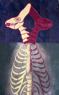
Here they are cut out. I ironed wonder under to the back of the fabric and then used my new x-acto knife to cut them out (thanks Messmers!) I like them overlapped better - like Siamese twins.
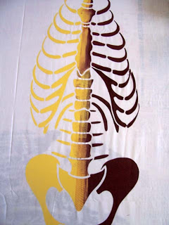
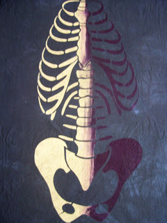
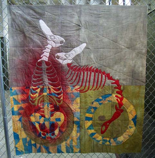
4. The Siamese twins need a body. I have a quilt that is nearly done with the same heads and each head has a different skeleton. One has a human skeleton and the other has a rabbit skeleton. These Siamese heads are going to share one human skeleton. It's time to cut another stencil.


Will it get resolved??!?!? It seems likely. Check back tomorrow for an update.
So. Here we go.
1. I started with a piece of red fabric, about 4' x 6' that had a large spine painted on it in light green. I made this fabric sometime in October or November and then it sat folded up on my shelves because it is hideous.
2. I cut a stencil to use on my last quilt that I'm still excited about. Here it is:
It's already taped onto my silkscreen. I'm not very good at planning, so the only way it would fit on the screen is to angle it and then fill in the open spaces with paper (so no ink leaks through the screen). It looks janky but it works.
Getting ready to print. I'm using Aqua Brite textile pigments for this. The fabric stays soft and you can play with how wash-fast they are. Sometimes I like to wash them out of the fabric without heat setting for a worn look.
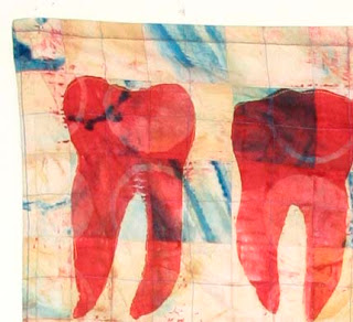
A couple of heads printed in a loose repeat. I wasn't too concerned with the spacing on this.
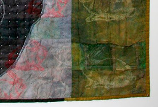
Mirrored heads. If you look close, the eye on the yellow one looks wonky. I forgot to put the little eye stencil back on the screen after washing it so I had to improvise.
3. The fabric isn't doing much for me, but I do like the printed heads.
3. The fabric isn't doing much for me, but I do like the printed heads.
Here they are cut out. I ironed wonder under to the back of the fabric and then used my new x-acto knife to cut them out (thanks Messmers!) I like them overlapped better - like Siamese twins.
4. The Siamese twins need a body. I have a quilt that is nearly done with the same heads and each head has a different skeleton. One has a human skeleton and the other has a rabbit skeleton. These Siamese heads are going to share one human skeleton. It's time to cut another stencil.
This is the stencil drawn out in thick sharpie, then cut out with an x-acto. It's a good idea to tape delicate areas before cutting to add strength to the stencil. For this one, I used butcher paper. It's cheap and comes on a roll. The downside is that stencils cut from butcher paper don't last very long. So today I ordered some Tyvek from ebay. Most likely I will jump up and down when it arrives.
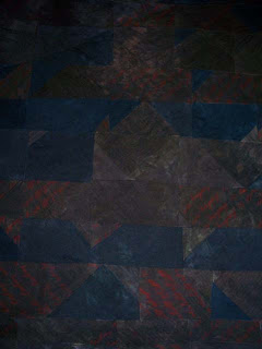
5. Ok. This next picture is so ugly. Maybe if I hadn't graduated from Iowa State (cardinal and gold) I wouldn't think so. But seriously. It looks like it was airbrushed in Gatlinburg. I'm not too worried, though. I have a plan.
5. Ok. This next picture is so ugly. Maybe if I hadn't graduated from Iowa State (cardinal and gold) I wouldn't think so. But seriously. It looks like it was airbrushed in Gatlinburg. I'm not too worried, though. I have a plan.
Will it get resolved??!?!? It seems likely. Check back tomorrow for an update.